Discontinuous variation: data handling and analysis
Lesson 1 / 5
Lesson video
Lesson slides
Lesson details
Lesson outcome
Waxaan sawiri karaa xogta kala duwanaanshaha aan joogto ahayn ee bar chart iyo soo jeedin karaa sababaha suurtagalka ah ee kala duwanaanshaha.
Introduction
In this lesson: I can plot data on discontinuous variation on a bar chart and suggest possible causes for the variation. Using a bar chart to display discontinuous data. Plotting data for discontinuous variation on a bar chart.
Show transcript
Worksheet
not available yet
Quizzes
1. In the image, which earlobes are attached?
- top left
- Correct answer:top right
- Correct answer:bottom left
- bottom right
2. Which tally is correct for six items?
- Correct answer:
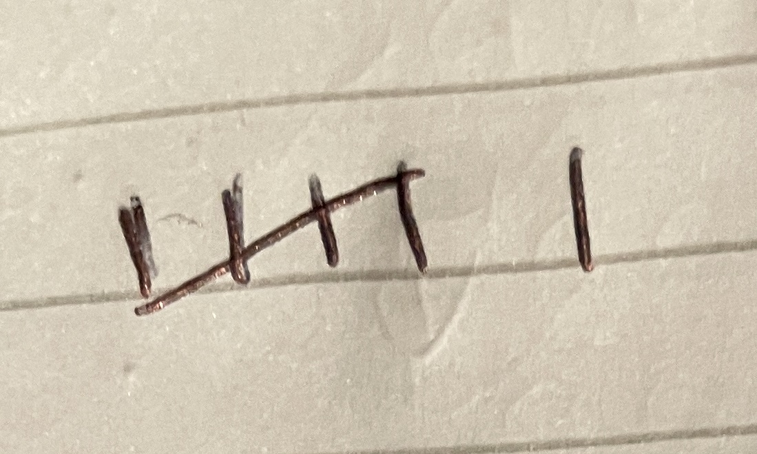
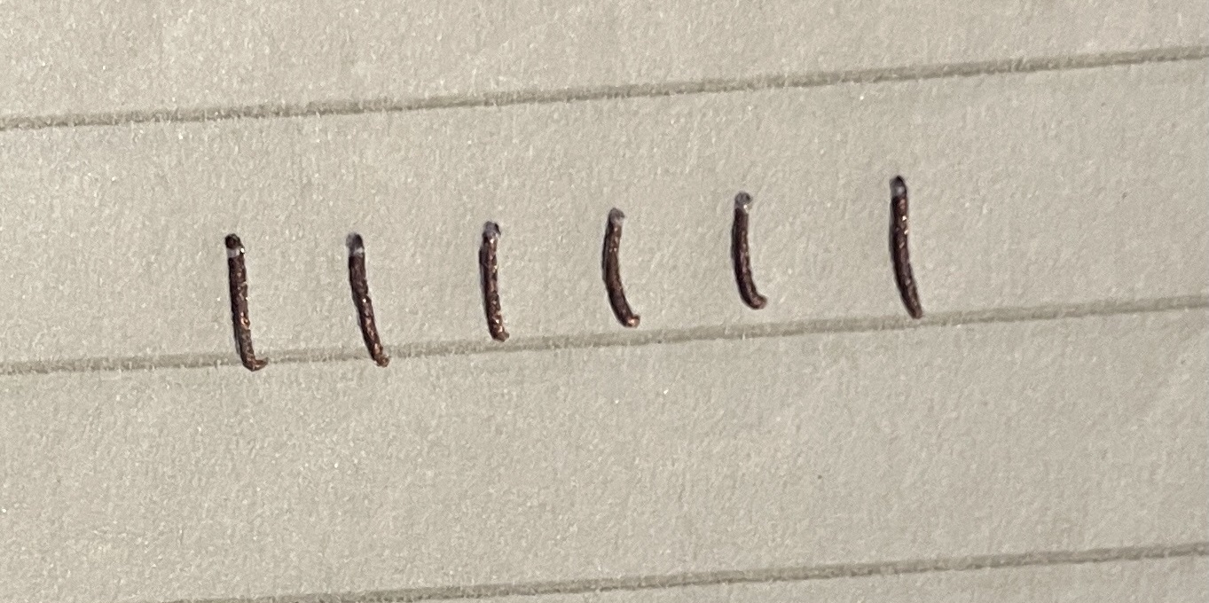
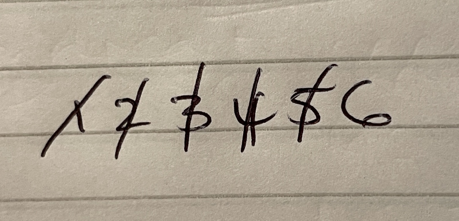
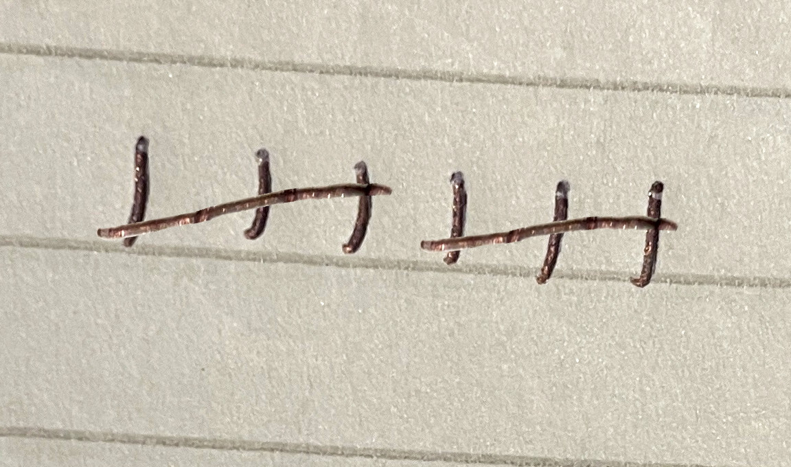
- Correct answer:
3. Which type of graph is this?
- Correct answer:line graph
- bar chart
- histogram
- pie chart
4. On which axis of a graph should you plot the independent variable?
- Correct answer:x-axis
- y-axis
- no axis
5. On which axis of a graph should you plot the dependent variable?
- x-axis
- Correct answer:y-axis
- no axis
6. Why is it often valuable to plot data as a graph?
- Because it looks smart and presentable.
- It’s a different way of showing the data.
- Correct answer:It tends to show trends and patterns more clearly.
- A table tends to show trends and patterns clearly.
1. Which type of graph is this?
- line graph
- histogram
- Correct answer:bar chart
- pie chart
2. How should a bar chart be plotted?
- Correct answer:the bars should not touch each other
- the bars should touch each other
- bars of different widths
- Correct answer:bars of equal widths
3. Which of these factors causes discontinuous variation between organisms?
- Correct answer:genetics
- environment
- lifestyle
4. Which statements about the bar chart are true?
- it shows continuous data
- Correct answer:it shows discontinuous data
- Correct answer:it shows categoric data
- Correct answer:it shows measurements of discontinuous variation
- categories are shown on the y-axis
5. Eye colour is genetic, but there many variations of colours. How many genes must control this feature?
- none
- one
- Correct answer:several
What pupils see
The same lesson as a pupil sees it. You can set any section as work on its own.
- IntroductionPrepare
- Starter quizActivate · 6 questions
- Lesson videoLearn
- Exit quizCheck · 5 questions